For brands that are looking to make a strong impact with consumers, the right color can speak louder than words. As a result, color is a primary element that designers will consider when developing any kind of visually-appealing package – whether creating a design to match a brand’s established identity or introducing a new package to capture consumer attention at the point of sale.
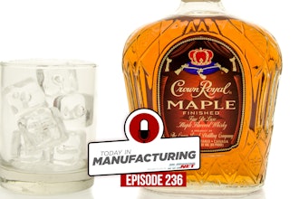
Depending on the market that a particular brand caters to, there are often different color trends they can follow. For example, Crown has worked in the past on projects for wines and spirits brands that have been looking to utilize promotional metal tins. The preference there was to follow the trend of employing darker hues — shades of blacks and dark greys — in order to communicate a sense of elegance and premium quality to the product and its packaging. For the confectionary market, in contrast, we more often work on colorful metal tins that are as bold, bright and shapely as the sweets that they contain. For cosmetics, we return to conveying a sense of luxury and elegance for brands, but for this market that can be communicated through the use of subtle, metallic shades.
In these and similar markets, brands face an interesting challenge, as they look to simultaneously follow packaging color trends that have proven to be popular with consumers, while also wanting to stand out from the competition. One solution it to go beyond color and employ special finishes that can help advance hues to a new level. Gloss finishes remain the most popular choice for packaging of all kinds, but brands should also consider utilizing alternatives to help their product stand out against other tins on the shelf. We are already seeing this being used to considerable effect today: packaging for men, for example, tends to employ a matt finish to differentiate it from the glossy packaging that typically targets women. Similarly, when aiming to capture the attention of a younger demographic, such as children or tweens, brands are using sparkling, holographic or even pearlescent finishes to complement the bright colors on their packaging.
It is important to remember that there must always be a balance between following a design trend that has been proven to resonate with consumers and finding ways to stand out among competitors. By mixing colors or special finishes with other techniques like shaping, embossing or other special effects, brands have at their disposal a range of options that will help maintain their identity while enhancing their package design.
About
By: Sheila Heath, Director of Marketing, CROWN Speciality Packaging North America
Crown Holdings, Inc., through its subsidiaries, is a leading supplier of packaging products to consumer marketing companies around the world. World headquarters are located in Philadelphia, PA. For more information, visit www.crowncork.com.


